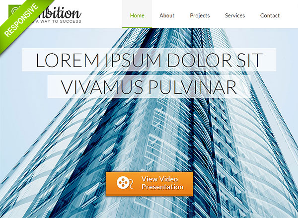
Parallax in web design is an effect which is meant to impart a website some depth and thus mainly applied to background. This means that the background moves slower than the overlaying content. The use of parallax effect also means that the template is designed as a one page, so there’re two continuous layers which move relative to one another at different speeds. Although parallax effect is not a must-have feature for a website, it’s still nice to have it to liven up experience for the visitors. Make browsing your website less monotonous and more engaging for them.
Travel Parallax Responsive Site Theme

Business Responsive Parallax Template

One Page Corporate Responsive Parallax Template

Business Parallax Responsive Site Theme

One Page Parallax Photographer Portfolio

One Page Parallax Portfolio Template

Photography One Page Parallax Template

Photographer One Page Parallax Template

Minimal One Page Parallax Portfolio Theme

One Page Parallax Creative Portfolio

Parallax One Page Responsive Template

One Page Parallax Design Portfolio

Responsive Parallax One Page Portfolio

Responsive Parallax One Page HTML5 Template

Portfolio Responsive Parallax Template

Clean Portfolio One Page Parallax HTML5 Theme

Creative Portfolio One Page Parallax Theme

Responsive Portfolio with Parallax Template

One Page Parallax Responsive HTML Theme

Photographer Responsive HTML5 One Page Template

Related posts:
- 20 One Page Designs Single page type design is very convenient if you're aiming...
- 20 Photography Templates Photography and photo portfolio templates exist in different formats and...
- 20 Twitter Bootstrap Templates The main gist of bootstrap templates is not so much...
- A Showcase of Amazing FlashMoto Templates Having announced partnership with FlashMoto we can’t help making a...
- Best Creative Flash Templates 2012 The best always means “on top”. Despite the fact that...
Follow FlashMint on Twitter for more awesome Flash Tutorials!
"Like" FlashMint FaceBook Page to stay in touch!


